Admin Page Grids
In the Magento Admin, a grid is used on all pages to establish global layouts for page templates. The grid assigns a set number of columns and rows for a page, and designers can create a layout by dividing the columns into sections, where design patterns and content can be placed.
Page Grid
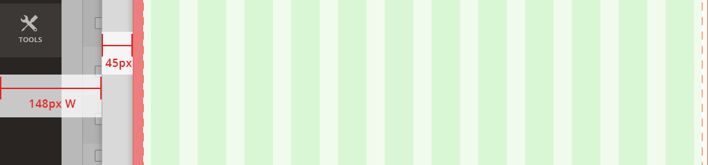
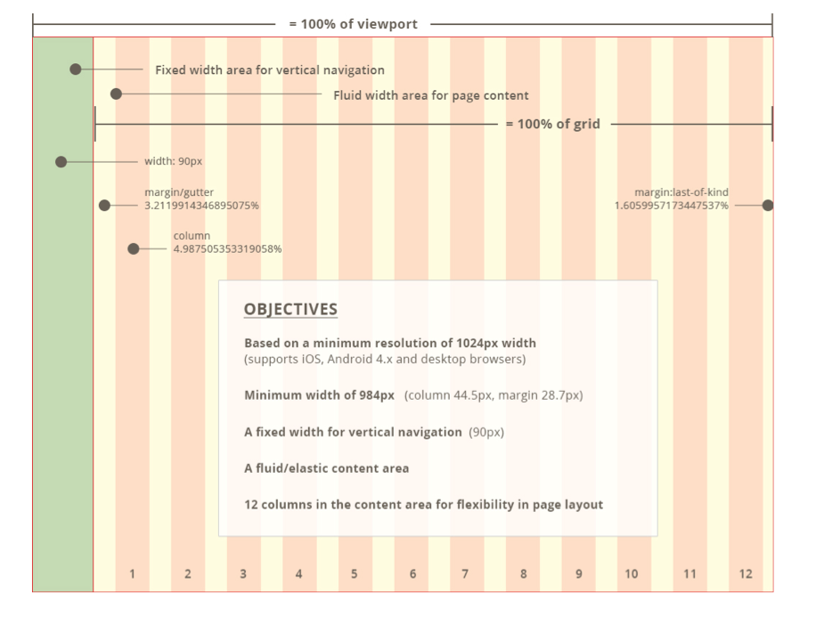
- A 12-column fluid-width content grid is placed next to the page’s 1-column fixed-width left navigation
- The 12-column grid’s minimum width spans 984px. The grid expands its layout across larger screens.
- For views smaller than 984px, a page’s layout doesn’t change as the page shrinks to fit smaller screen widths.
Slide-Out Grid
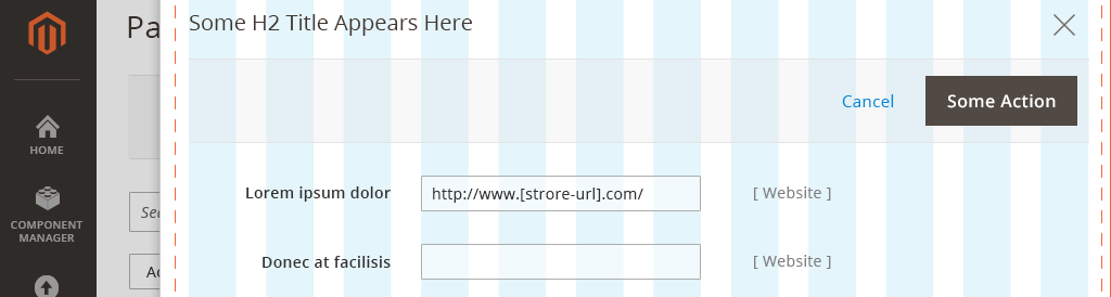
A Slide-out panel, similar to a modal window, breaks apart and simplifies a complex subtask that is included within a primary task.
For example:
- On a product details form page, a user clicks "Add Attribute".
- A panel slides over the parent page and shows "Add Attribute" functionality.
- When the user finishes adding attributes, the panel disappears, and the user returns the product details form page.
Layout and behavior: When a panel spawns, it slides from right to left atop and almost completely over the parent page. A narrow gutter of space remains at left, showing the left navigation and a small sliver of the parent page.
Standard layout within the edges of a browser screen
(Panel position in relation to browser edge)
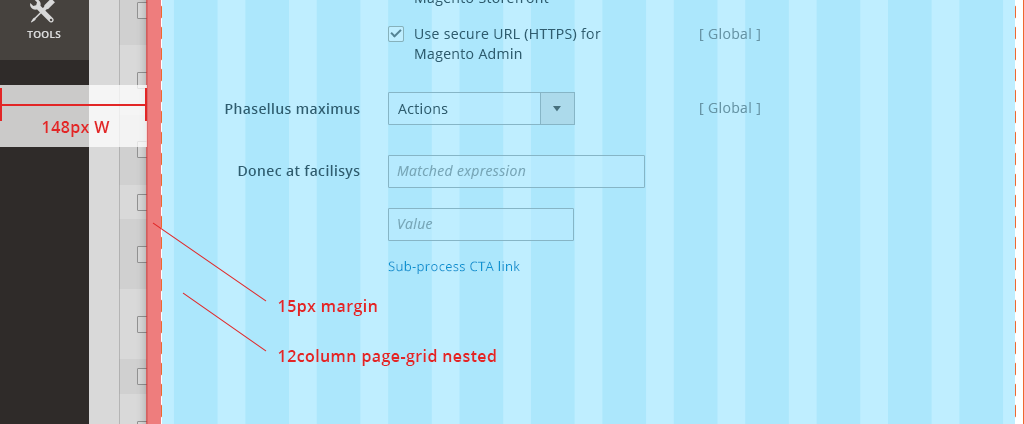
Spacing: Slide-out content is contained in a 12-column page grid, with additional 15px padding on the left edge. The gutter spacing at left is fluid, based on browser width.
(Nested page-grid with additional padding)
Nested Slide-outs: For multiple panels displayed, additional gutter space is used at left to show a small sliver of a Slide-out below another Slide-out.