How to add an appearance
Magento Commerce only
Appearances provide different layout and styling options for a content type. For example, the Banner content type has four appearances. Each appearance shows a different layout for the Banner’s included text and button.
This topic shows how to add appearances to Page Builder’s native content types. An overview of the steps and the files you need to add are illustrated here:

Steps for adding appearances
These steps also apply to adding appearances to your custom content types and third-party content types.
Step 1: Add virtual type for VisualSelect class
First, we need a way select an appearance within the Admin UI. In Page Builder, we use the VisualSelect class. This class provides the UI for selecting different appearances. For example, the VisualSelect class for the Banner provides four appearances to choose from:
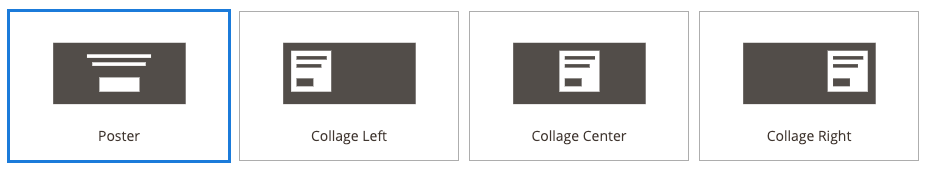
Visual selector for Banner
To add a new appearance option for one of Page Builder’s native content types (such as the Banner), create a new di.xml file in your module, as shown here:
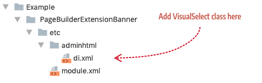
File and location for the VisualSelect class
Within the di.xml file, add a virtual type using theVisualSelect class with the Banner’s virtual type name (<virtualType name="AppearanceSourceBanner"), as shown here:
1
2
3
4
5
6
7
8
9
10
11
12
13
<config xmlns:xsi="http://www.w3.org/2001/XMLSchema-instance" xsi:noNamespaceSchemaLocation="urn:magento:framework:ObjectManager/etc/config.xsd">
    <virtualType name="AppearanceSourceBanner" type="Magento\PageBuilder\Model\Source\VisualSelect">
        <arguments>
            <argument name="optionsData" xsi:type="array">
                <item name="simple-poster" xsi:type="array">
                    <item name="value" xsi:type="string">simple-poster</item>
                    <item name="title" xsi:type="string" translate="true">Simple Poster</item>
                    <item name="icon" xsi:type="string">Example_PageBuilderBannerAppearance/css/images/content-type/banner/appearance/simple-poster.svg</item>
                </item>
            </argument>
        </arguments>
    </virtualType>
</config>
VisualSelect class for new Banner appearance
Using the same class name as the Banner ensures that Magento’s XML merging will add your new visual appearance option to the existing Banner appearance options.
The following table describes the configuration arguments for each appearance option.
| Arguments | Description |
|---|---|
optionsData |
Grouping array for all the appearance options of a content type. |
item array |
Grouping array of properties that define an appearance option. We recommend you match the name of the item array to the option’s value string. In our example, the item array’s name is simple-poster, which matches the option’s value string simple-poster. |
value |
String that matches the appearance name defined in the content type’s configuration file. Page Builder uses this string value to link the option to the appearance. |
title |
Display name for the appearance option. Banner example: Poster. |
icon |
Path to the .svg icon for the appearance: view/adminthtml/web/css/images/content-type/[content-type-name]/appearance/*.svg. See Creating an icon for your appearance |
noticeMessage |
(Not shown in example.) The noticeMessage displays a message below the appearance options when the appearance is selected. For example, two of the Row appearances (full-width and full-bleed) define noticeMessage strings that display when selected. |
To add more appearance options, simply create more item arrays with names that match the value, as shown here:
1
2
3
4
5
6
7
8
9
10
<item name="tall" xsi:type="array">
    <item name="value" xsi:type="string">tall</item>
    <item name="title" xsi:type="string" translate="true">Tall</item>
    <item name="icon" xsi:type="string">Example_PageBuilderExtensionBanner/css/images/content-type/banner/appearance/tall.svg</item>
</item>
<item name="short" xsi:type="array">
    <item name="value" xsi:type="string">short</item>
    <item name="title" xsi:type="string" translate="true">Short</item>
    <item name="icon" xsi:type="string">Example_PageBuilderBannerExtensionBanner/css/images/content-type/banner/appearance/short.svg</item>
</item>
Example of additional appearance options
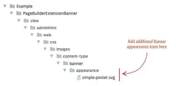
Create an appearance icon
Appearance icons are .svg files that graphically depict the layout of an appearance. Add your additional appearance icons to your module’s css appearance directory (css/images/content-type/[content-type-name]/appearance/). Additional appearance icons for the Banner would be added as shown here:
Additional appearance icons for Banner
You can use any design tool to create your SVG. But if you want to match your appearance icons to Page Builder’s icons perfectly, use the SVG structure and dimensions shown here:
1
2
3
4
5
6
7
8
9
<svg xmlns="http://www.w3.org/2000/svg" width="218" height="110" viewBox="0 0 218 110">
  <g fill="none" fill-rule="evenodd">
    <rect width="149" height="69" x="35" y="21" fill="#524D49"/>
    <!--- Optional shapes displayed on top of base rect -->
    <rect width="45" height="16" x="87" y="60" fill="#FFF"/>
    <rect width="72" height="4" x="73" y="34" fill="#FFF"/>
    <rect width="60" height="4" x="79" y="43" fill="#FFF"/>
  </g>
</svg>
SVG appearance template
These specific dimensions ensure that your icon fits seamlessly with Page Builder’s existing appearance icons:
| Property | Value |
|---|---|
svg width |
218 |
svg height |
110 |
svg viewbox |
0 0 218 110 |
g fill |
none |
base rect width |
149 |
base rect height |
69 |
base rect x |
35 |
base rect y |
21 |
base rect fill |
#524D49 |
other shape fill properties |
#FFF |
Step 2: Add appearance configurations
Appearance configurations connect the data entered in a content type’s form to its HTML templates. For example, the Heading content type has an <html> config element (<html name="heading_text" />) that maps the text entered into the content type’s heading_text field (<field name="heading_text" formElement="input">) to the Heading’s Knockout template binding (html="data.main.html"), as illustrated here:
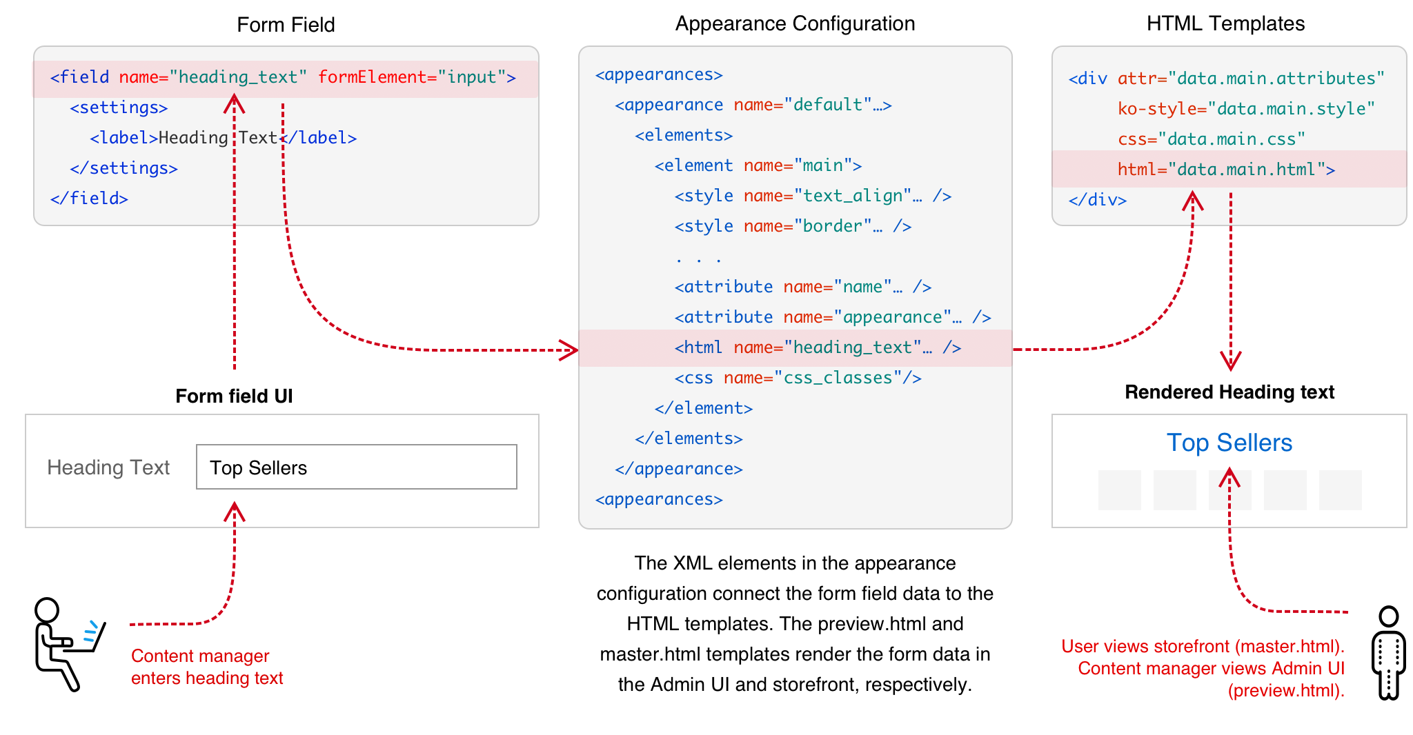
Appearance configurations explained
The same concept applies to styles, attributes, and css elements. These elements ensure that the form settings (both content and styles) get applied to the templates as expected.
To add a new Banner appearance configuration, create a content type config file named banner.xml, as shown here:
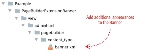
Add additional appearances to Banner content type
This procedure applies to any native content type you want to extend. In other words, you can use the file name (such as heading.xml) and type name (such as <type name="heading">) of any content type to extend it based on Magento’s XML merging behavior.
An example banner.xml config file for a new simple-poster appearance is shown here:
1
2
3
4
5
6
7
8
9
10
11
12
13
14
15
16
17
18
19
20
21
22
23
24
<?xml version="1.0"?>
<config xmlns:xsi="http://www.w3.org/2001/XMLSchema-instance" xsi:noNamespaceSchemaLocation="urn:magento:module:Magento_PageBuilder:etc/content_type.xsd">
    <type name="banner">
        <children default_policy="deny"/>
        <appearances>
            <appearance name="simple-poster"
                        preview_template="Example_PageBuilderBannerAppearance/content-type/banner/simple-poster/preview"
                        master_template="Example_PageBuilderBannerAppearance/content-type/banner/simple-poster/master"
                        reader="Magento_PageBuilder/js/master-format/read/configurable">
                <elements>
                    <element name="main">
                        <style name="display" source="display" converter="Magento_PageBuilder/js/converter/style/display" preview_converter="Magento_PageBuilder/js/converter/style/preview/display"/>
                        <style name="margins" storage_key="margins_and_padding" reader="Magento_PageBuilder/js/property/margins" converter="Magento_PageBuilder/js/converter/style/margins"/>
                        <attribute name="name" source="data-content-type"/>
                        <attribute name="appearance" source="data-appearance"/>
                        <attribute name="show_button" source="data-show-button"/>
                        <attribute name="show_overlay" source="data-show-overlay"/>
                        <css name="css_classes"/>
                    </element>
                    . . .
            </appearance>
        </appearances>
    </type>
</config>
Additional simple-poster appearance for the Banner content type
Step 3: Add appearance forms
Appearances for a content type can share the same form or use different forms. For example, the Products content type uses two different forms, one for each appearance. The Grid appearance uses the pagebuilder_products_form.xml to provide options for displaying products in a grid. While the Carousel appearance uses the pagebuilder_products_carousel_form.xml to provide extra options for displaying products in a carousel.
When you select an appearance with a form, Page Builder replaces the content type’s form (defined in the <type> element) with the appearance’s form. But when you select an appearance that does not have a form defined, the appearance switches back to using the content type’s form.
1
2
3
<config xmlns:xsi="http://www.w3.org/2001/XMLSchema-instance"...>
    <type name="products"
          form="pagebuilder_products_form"
Content type form used by default for all appearances
To add a form for an appearance, add a <form> element as a child of the <appearance> element in your content type’s config file. As mentioned, the Products content type uses a form for its Carousel appearance, as shown here:
1
2
3
4
5
6
7
<appearance name="carousel"
            preview_template="Magento_PageBuilder/content-type/products/grid/preview"
            master_template="Magento_PageBuilder/content-type/products/grid/master"
            reader="Magento_PageBuilder/js/master-format/read/configurable">
    <form>pagebuilder_products_carousel_form</form>
    <elements>
    . . .
Adding a form to an appearance
Step 4: Add appearance templates
Appearances use different HTML templates to create different layouts. They also use templates to apply different styles to the same layouts. For example, the Banner uses four sets of preview.html and master.html templates, one set for each appearance:
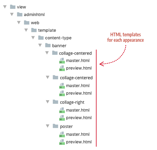
Banner appearance templates
Notice how Page Builder organizes the Banner templates by appearance name. We recommend the same practice when adding templates for your appearances.
To create templates for additional Banner appearances, such as the simple-poster described in steps 1 and 2, add a new appearance folder with your master.html and preview.html templates, as shown here:
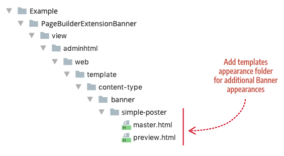
Add additional templates to template/content-type/[content-type-name]/[appearance-name]
Step 5: Add appearance styles
Appearances use different CSS/LESS files to create different visual styles for a content type. For example, the Banner content type uses a different .less file for each appearance, as shown here:
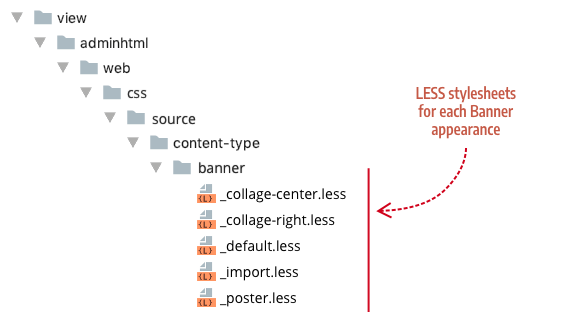
Banner stylesheets
To create a stylesheet for an additional Banner appearance, such as the simple-poster, add a folder named banner and a .less file with the name of the appearance, as shown here:
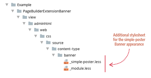
Add additional stylesheets to css/source/content-type/[content-type-name]/
The _module.less file is an import file that ensures the additional stylesheet gets added to the existing Banner styles. The _module.xml file for our simple-poster.less file looks like this:
1
@import "_simple-poster";
Use _module.less for import statements
Example Module
An example module for this topic is available for download in the pagebuilder-examples repository.
Final thoughts
Using appearances to extend Page Builder’s native content types represents one of Page Builder’s best practices for creating a variety of new content building blocks based on existing content types.