How to change breakpoints
Magento Commerce only
This topic describes how to change the default mobile breakpoint in Page Builder.
Default mobile breakpoint
By default, when you configure Page Builder to render a background image for a container, it uses a mobile image when the container’s width is equal to or less than 768px. Page Builder defines this mobile breakpoint in the Magento_PageBuilder/etc/view.xml file, as shown here:
1
2
3
4
5
6
7
8
9
10
11
12
<?xml version="1.0"?>
<view xmlns:xsi="http://www.w3.org/2001/XMLSchema-instance" xsi:noNamespaceSchemaLocation="urn:magento:framework:Config/etc/view.xsd">
...
<vars module="Magento_PageBuilder">
    <var name="breakpoints">
        <var name="mobile">
            <var name="conditions">
                <var name="max-width">768px</var>
            </var>
        </var>
    </var>
</vars>
Changing the mobile breakpoint
If your custom theme also uses this max-width breakpoint for your mobile layout, no changes are required.
However, if your custom theme uses a different mobile breakpoint, you need to overwrite the default breakpoint by either:
- Adding the theme’s breakpoint to the theme’s
view.xmlfile. -
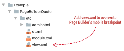
Adding a
view.xmlfile in theetcdirectory of your content type as shown here:
In either case, if your theme uses a mobile breakpoint max-width of 600px, you would add the following markup to the view.xml file:
1
2
3
4
5
6
7
8
9
10
11
12
<?xml version="1.0"?>
<view xmlns:xsi="http://www.w3.org/2001/XMLSchema-instance" xsi:noNamespaceSchemaLocation="urn:magento:framework:Config/etc/view.xsd">
    <vars module="Magento_PageBuilder">
        <var name="breakpoints">
            <var name="mobile">
                <var name="conditions">
                    <var name="max-width">600px</var>
                </var>
            </var>
        </var>
    </vars>
</view>
This directs Page Builder to use this mobile breakpoint instead of its default breakpoint of 768px. You can add other responsive breakpoints from your custom theme in the same way.